Field report
Every board placed with intent. Now the site is too.
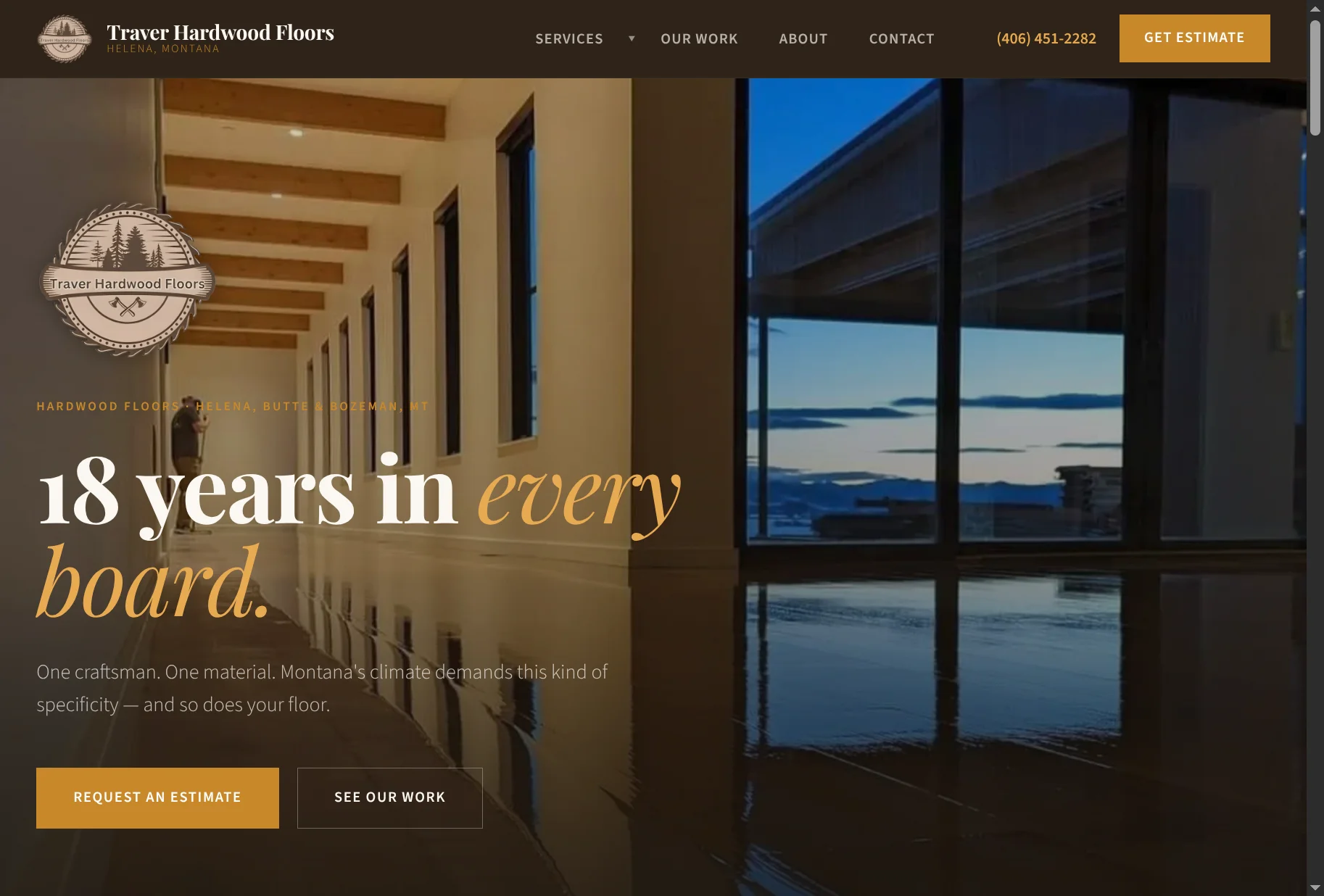
Chris Traver has been laying hardwood floors in western Montana for 18 years. The redesign started with the floors themselves.
The problem
Chris Traver has been laying hardwood floors in western Montana for 18 years. His site didn't show it. The previous design was functional. But it read like a flooring store, not a craftsman. On a site where the portfolio is the only argument that matters, there were two projects in it.
The redesign started with the floors themselves — warm espresso darks, amber light, a palette pulled from aged fir and walnut endgrain. The typography got weight. The layout got wide enough to let photography breathe. Dark sections alternate with light ones so the page has pace, not just content.
A design critique after the first build caught five things worth fixing before it shipped. The logo had gone missing. The About section was doing double duty. The service cards had no photography on a site built around photography. Small things. The kind that matter.
The animations are themed around the job. Each element on the hero slides in with a two-pixel overshoot before settling — like a board nudging into its neighbor and locking flush. The proof bar counts up. The amber border on a service card sweeps left to right on hover. You notice it without noticing you noticed it.
What we delivered
- Full site redesign — dark/light alternating sections, photography-first layout
- Color palette derived from hardwood — espresso, amber, aged fir tones
- Custom animations — board-settle overshoot, counting proof bar, sweep hovers
- Typography overhaul — Playfair Display + Source Sans 3
- Portfolio expansion and photography integration
- Hugo static site with Go API, Caddy, Docker, GitHub Actions
- Zero-dependency frontend — IntersectionObserver, requestAnimationFrame
Let's talk
Have a similar project?
Tell us what you're working on. We'll tell you whether we're the right fit.